
You already have data. That's not the problem.
The problem is that your numbers live in five different places, none of them agree, and every important question turns into a scavenger hunt. You open QuickBooks to check profit. Then payroll to see labor cost. Then your CRM to understand sales. Then a project tool to figure out whether that “good month” was good.
By the time you piece it together, the decision is late.
That's where business intelligence reporting earns its keep. Not as fancy software. Not as an IT project. As a practical way to answer the questions that matter when you run a service business: Which jobs make money? Which clients drain margin? Can I afford this hire? Is cash getting tighter even though revenue looks fine?
What Is Business Intelligence Reporting Really
A lot of owners think business intelligence reporting is something built for large companies with full-time analysts and expensive software.
That's outdated thinking.
Cloud tools changed the market. The global BI market is projected to reach $11.4 billion by 2025, and 70% of small and midsize businesses had adopted BI reporting tools by 2024 to monitor KPIs in real time, according to this BI market overview.
It's not a dashboard. It's an answer system
Here's the simple version.
Business intelligence reporting takes data from the systems you already use, cleans it up, connects it, and turns it into reports that help you make decisions. That's it.
If bookkeeping tells you what happened last month, BI reporting helps you answer:
- Which service line makes the most money
- Which manager runs the strongest margin
- Whether payroll is growing faster than revenue
- What's happening to cash before it becomes a problem
It's like a GPS.
Your accounting system is the map. Useful, but static. Business intelligence reporting is the live navigation. It shows where you are, what's changing, and where trouble is building.
A real-world version of the problem
Say you run a clinic, agency, law firm, or contracting business.
Revenue looks decent. Your P&L says you made money. But you still feel pressure every payroll cycle. One team is slammed, another is underused, and you're not sure whether the issue is pricing, staffing, collections, or project mix.
That's normal. Most owners aren't short on data. They're short on clarity.
Business intelligence reporting matters when it helps an owner stop asking, “What happened?” and start asking, “What should I do next?”
If you want a good plain-English companion on the reporting side of the house, Doczen has a useful piece on insights for improving business operations. It's worth reading because many owners first need better operating visibility before they're ready for deeper BI work.
Why Your Business Needs More Than a Rearview Mirror
Traditional financial reports matter. You need a clean P&L, balance sheet, and cash flow statement.
But those reports are a rearview mirror.
They tell you where you've been. They don't do enough to help you steer through this week's pricing issue, next month's hiring decision, or the client relationship that's slowly killing margin.
Rearview mirror versus windshield
A rearview mirror is helpful when you want context. A windshield is what you use to drive.
That's the difference between standard reporting and business intelligence reporting.
Standard reporting says:
- Revenue was up
- Payroll was higher
- Net income fell
Business intelligence reporting says:
- Revenue was up because one service line carried the month
- Payroll rose because billable utilization slipped
- Margin fell in one location, one team, or one project type
That second version is the one you can act on.
What owners actually gain
As of 2023, 85% of organizations reported that BI reporting directly improved corporate strategy, and adopting BI tools can generate a 30% increase in operational efficiency for SMBs, according to Databricks' guide to BI reporting.
That sounds big, but the practical value is simpler than the headline.
Clarity
You stop arguing over whose spreadsheet is right. The team sees the same numbers, in the same format, with the same definitions.
Confidence
You can make a hiring, pricing, or scheduling decision without guessing.
Speed
You spend less time assembling reports and more time using them.
Practical rule: If a report takes longer to interpret than the decision itself, the report is poorly designed.
Competitive edge for normal businesses
You don't need to be a tech company to benefit. In fact, service businesses often benefit faster because labor, pricing, and utilization move profit so quickly.
For a contractor, one dashboard can show whether a “busy” month produced cash.
For a healthcare practice, one dashboard can show whether visit volume is rising while collections lag.
For a law firm or agency, one dashboard can show whether top-line growth hides weak client profitability.
If you want a broader view of how cloud delivery changed access to these tools, F1Group's BI guide is a useful primer.
The Building Blocks of a Good BI System
Most owners hear terms like pipeline, warehouse, ETL, model, and dashboard and assume the whole thing is too technical to bother with.
It's not.
A good BI system works a lot like a kitchen. You gather ingredients, prep them, cook them in the right order, plate the meal, and make sure nobody gets food poisoning. Same logic here.
A technically strong BI setup uses a governed pipeline that pulls data from systems like CRM, finance, and operations into a warehouse so the business has a single source of truth and fewer conflicting numbers, as explained in this Databricks overview of BI architecture.
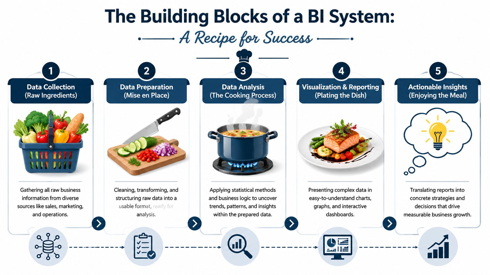
Raw ingredients
Your ingredients are the systems you already use.
- Accounting data from QuickBooks or another general ledger
- Payroll data from your payroll platform
- Sales data from your CRM
- Operations data from project management, scheduling, or job-costing tools
If one source is missing, the report will usually feel incomplete. That's why owners often say, “The dashboard looks nice, but it doesn't answer my question.” The missing answer is usually a missing ingredient.
Prep work
This is the boring part, and it's where a lot of bad reporting dies.
Data has to be cleaned. Customer names need to match. Dates need to line up. Payroll categories need to be consistent. Projects need to tie back to revenue and labor.
You don't want your leadership team discovering in a meeting that “Acme Inc.”, “Acme”, and “ACME LLC” are all the same client.
The recipe
This is the logic layer.
A recipe tells the kitchen how to turn ingredients into dinner. In BI, the model tells the system how to turn raw data into useful metrics.
That might mean:
- Connecting labor cost to each project
- Mapping revenue to each service line
- Defining what counts as billable time
- Calculating profitability by client, provider, or crew
Without this layer, you get charts. With it, you get answers.
Plating the dish
This is the part people usually notice first.
The chart, scorecard, or dashboard should make the insight obvious. It should not force you to decode it like a puzzle. If the owner needs a meeting just to understand the chart, the chart failed.
A helpful next step is to look at how reporting systems get automated once the foundation is clean. MyOfficeOps has a practical resource on financial reporting automation that connects this idea to day-to-day back-office work.
Good reporting is not about showing everything. It's about showing the few things that make the next decision easier.
Food safety
This is governance, and its importance is often underestimated.
Who owns the metric?
Who can edit the logic?
Who can view payroll or provider compensation?
What counts as revenue?
When does the report refresh?
If you skip those questions, trust breaks fast. Once your managers stop trusting the numbers, the dashboard becomes wall art.
The Right Metrics for Your Industry
Most KPI advice is junk.
“Track revenue.” Fine. You already do.
“Watch expenses.” Obviously.
Useful business intelligence reporting starts with one business question and chooses metrics that answer it. High-value BI reporting depends on KPI selection tied directly to a business question, and metrics like profitability by segment are more actionable than vanity metrics because they connect cause and effect, as noted in this guide on business intelligence reports.
Construction and trades
A contractor doesn't need more generic monthly summaries. They need job-level truth.
| Industry | Key Performance Indicator (KPI) | Business Question it Answers |
|---|---|---|
| Construction | Job Profitability vs. Estimate | Are we bidding correctly, or are we winning work that doesn't pay? |
| Construction | Cash Flow by Project | Which jobs are creating cash strain even if they look profitable on paper? |
| Construction | Labor Cost per Job | Which crews or project types are burning hours faster than expected? |
| Construction | Change Order Recovery | Are we getting paid for scope changes, or giving work away? |
A construction owner can use this to decide whether to reprice work, change crew allocation, or tighten billing on open jobs.
Healthcare practices
A clinic or practice usually has strong activity data but weak financial connection to that activity.
| Industry | Key Performance Indicator (KPI) | Business Question it Answers |
|---|---|---|
| Healthcare | Revenue per Visit | Are visit volumes turning into enough revenue to support staffing and overhead? |
| Healthcare | Patient Lifetime Value | Which patient types or service lines create lasting value? |
| Healthcare | Provider Productivity | Which providers are full, underused, or misaligned with scheduling demand? |
| Healthcare | Collection Lag by Payer | Is the billing cycle slowing cash even when appointments are full? |
These metrics help answer practical questions. Do you add another provider? Do you shift appointment mix? Do you renegotiate with a payer? Do you need better follow-up on receivables?
Professional services
Law firms, agencies, consultants, and IT firms live and die by labor economics.
| Industry | Key Performance Indicator (KPI) | Business Question it Answers |
|---|---|---|
| Professional Services | Billable Utilization Rate | Are we using team capacity well, or paying for idle time? |
| Professional Services | Client Profitability | Which clients look good on revenue but perform poorly after labor is counted? |
| Professional Services | Realization Rate | Are we collecting what we thought we sold? |
| Professional Services | Revenue per Employee | Is growth coming from stronger output or just more headcount? |
The point is not to build a giant dashboard. The point is to pick metrics that lead to decisions.
If a KPI doesn't change a pricing, staffing, scheduling, or sales decision, it probably doesn't belong on the main dashboard.
What to skip
A lot of dashboards get bloated with metrics that feel important but don't move action.
Skip these unless they support a real question:
- Vanity totals that look impressive but hide margin problems
- Too many trend lines that make it hard to spot the exception
- Metrics with no owner because nobody knows who should respond
- Department-specific jargon that only one person can interpret
What a Good BI Dashboard Looks Like
Most bad dashboards suffer from the same problem. They try to prove how much data you have instead of helping someone decide what to do.
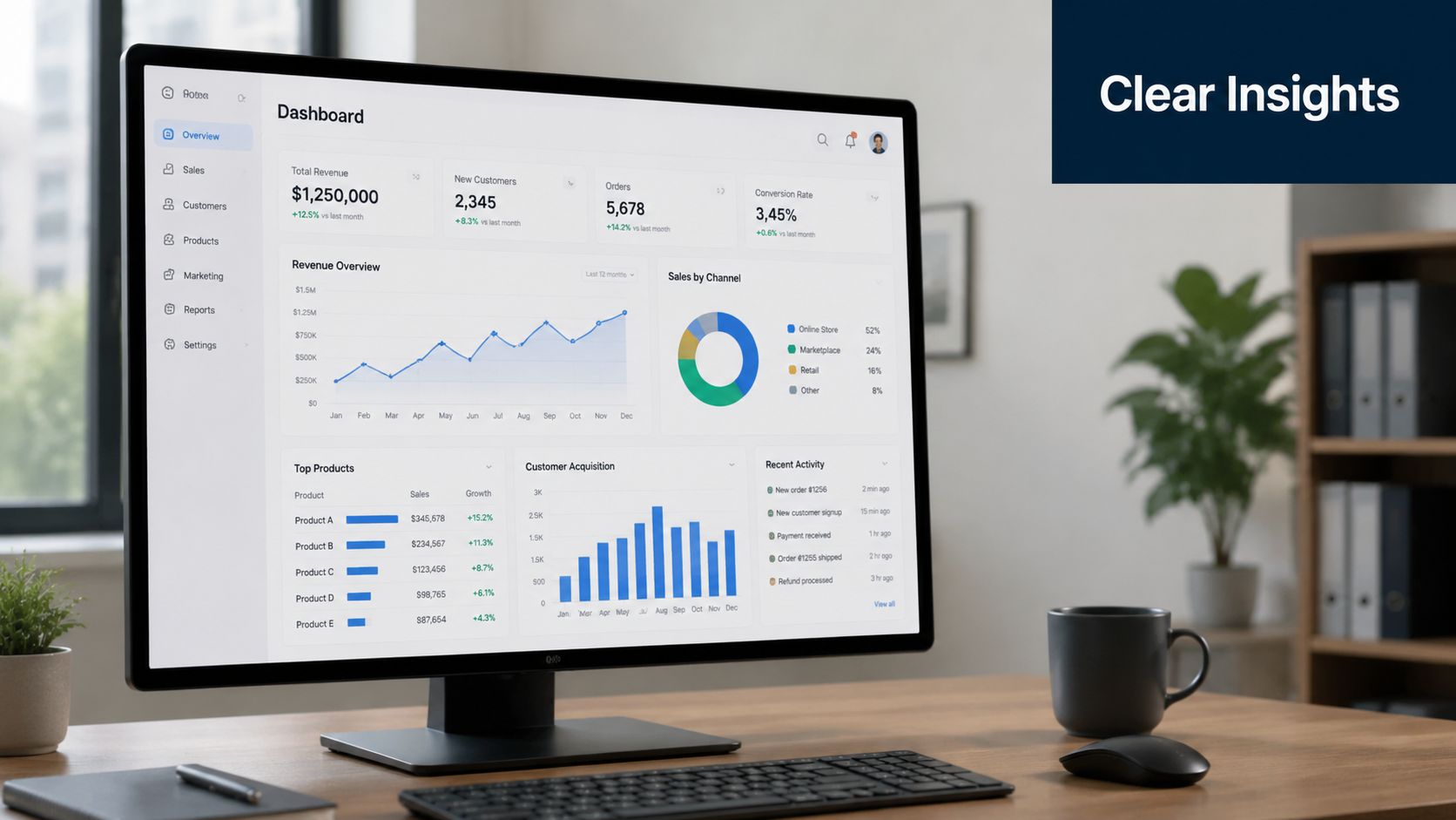
A good dashboard should answer one important question fast.
The cluttered version
I've seen dashboards with twenty charts on one screen. Revenue by month. Revenue by quarter. Revenue by rep. Revenue by customer. Revenue by service. Then five pie charts no one can read. Then a color-coded table that looks urgent but says nothing.
That's a data dump.
The owner opens it, stares for thirty seconds, then asks the controller for the actual answer anyway.
The useful version
Now compare that with a clean dashboard built around one question.
Cash dashboard
At the top, one number shows current cash. Next to it, a simple trend shows expected cash movement over the next few months based on receivables, payroll, fixed expenses, and known obligations. One section flags large upcoming outflows. Another shows overdue receivables by customer.
You can use that in a meeting immediately.
Profitability dashboard
One bar chart ranks service lines from highest to lowest margin. A second view lets you click into one service line and see margin by client or project manager. A small note explains major changes.
That's enough to trigger action.
One question, one chart
This is the rule I push hardest.
- Use one chart for one decision
- Put the most important metric at the top
- Add context, not clutter
- Make exceptions visible
- Let users drill down only when needed
If you want to see how custom dashboards get designed for a specific niche, this article on custom BI dashboards for real estate is a solid example of translating data into decisions for one industry.
Another useful reference point is understanding what belongs on a KPI dashboard in the first place. MyOfficeOps has a straightforward resource on what a KPI dashboard is.
A dashboard should help a manager understand the situation in under a minute. If it needs a tour guide, rebuild it.
A Simple Roadmap to Get Started with BI Reporting
Most owners delay business intelligence reporting because they think the first step is choosing software.
Wrong.
The first step is choosing the questions.
A common failure point is adoption. Teams build dashboards, admire them for a week, then go back to email chains and spreadsheets. That happens because BI only works when reports are understandable, role-specific, and tied to a clear decision workflow, which is why adoption is a usability issue, not just a data issue, as explained in Domo's article on BI reporting and analytics.
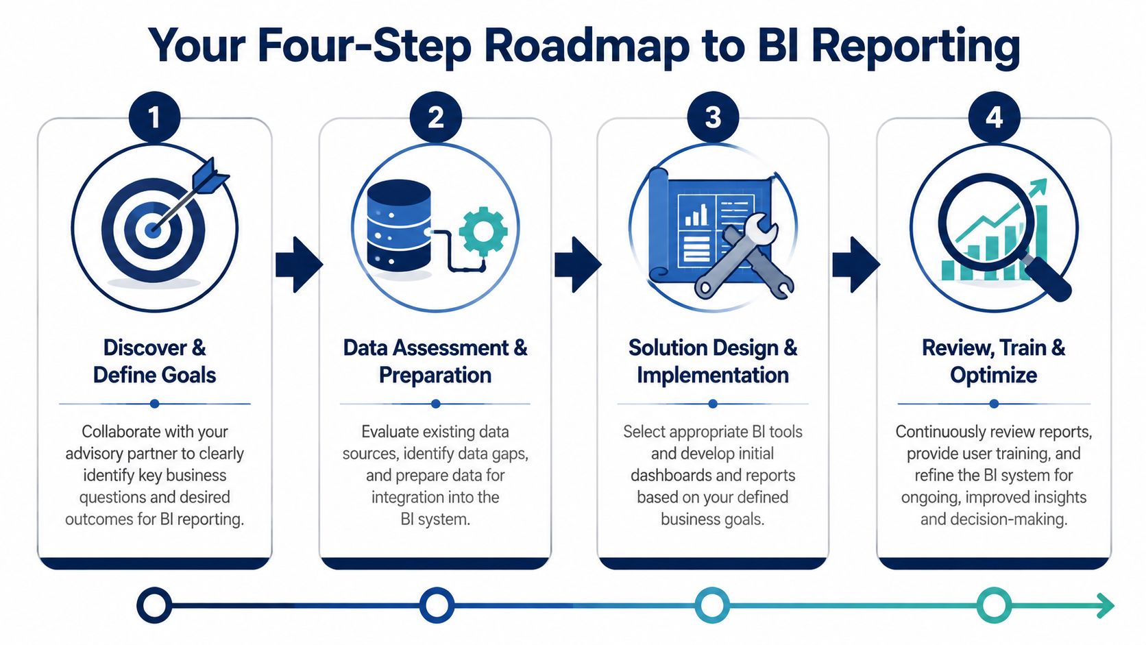
Step 1 Discover the real questions
Start with the pain, not the tool.
Ask:
- Which services, jobs, or clients are profitable
- Where is cash getting stuck
- Can we afford to hire
- Which teams are overstaffed or underused
- What numbers do we argue about every month
If you can narrow this to three to five business questions, you're in good shape.
Step 2 Clean and connect the data
Now look at your systems.
This usually means pulling together accounting, payroll, CRM, and operational data. Then someone has to standardize names, map categories, remove duplicates, and make the logic consistent.
For this, many businesses need outside help. An advisory firm, internal analyst, or finance partner can handle the heavy lifting. One option in that mix is a provider like MyOfficeOps, which offers bookkeeping, reporting, and advisory support and has a useful explainer on what analytics consulting looks like.
Step 3 Build the first version fast
Your first dashboard should be small.
Not perfect. Small.
A smart first version might include:
- Cash visibility so you can see pressure early
- Profitability by service or client so you know where margin lives
- Operational driver metrics such as utilization, labor cost, or collections
You don't need every report on day one. You need one report that gets used.
Decision filter: Build the first dashboard around a weekly meeting you already have. If the dashboard doesn't improve that meeting, it won't stick.
Step 4 Review, train, and refine
This part matters more than software demos.
A dashboard becomes useful when managers know:
- what each metric means
- what action they own
- when to escalate an issue
- how to ask for a refinement
Expect the first version to change. That's normal. One manager may need more drill-down. Another may need simpler visuals. A clinic director and a firm owner should not see the same dashboard layout if they make different decisions.
The goal is habit. Open the dashboard in weekly ops meetings. Use it in pricing reviews. Pull it up before hiring discussions. If it lives only in a browser tab nobody opens, you don't have BI. You have shelfware.
Making BI a Part of Your Business DNA
The true payoff from business intelligence reporting isn't the dashboard itself.
It's what changes in the business once people trust the numbers.
You stop reacting late. You stop confusing activity with profit. Your managers stop bringing opinions to meetings and start bringing evidence. Pricing gets tighter. Hiring gets smarter. Cash conversations get calmer because the facts are already on the table.
What lasting adoption looks like
In a healthy company, BI becomes part of the routine.
- Leaders ask better questions because they know the data can answer them
- Managers own specific metrics instead of waiting for finance to explain everything
- Reports support decisions on pricing, staffing, collections, and growth
- The business gets more predictable because problems show up earlier
You do not need to become a data expert to run a data-driven company.
You need clean financials, useful reporting, and the discipline to use them regularly. That's the shift. Moving from gut feel with scattered spreadsheets to a business that can explain where profit comes from, where cash gets tight, and what to do next.
If you're serious about building a stronger company, start with one question that matters, one report that answers it, and one meeting where that report drives the conversation.
If your business has solid revenue but weak visibility, MyOfficeOps can help connect the back office to better decisions through bookkeeping, reporting, financial analytics, and CFO-level advisory. The goal isn't more reports. It's clear answers on cash flow, profitability, hiring, and growth so you can run the business with less guesswork.