
A KPI dashboard is a visual report that pulls five to 10 actionable KPIs into one place so you can see performance against goals without digging through spreadsheets. It works best when those numbers have clear targets, so you know fast what's on track and what needs attention.
If you're like most small business owners, your numbers live in too many places. QuickBooks has one story. Your CRM has another. Payroll, job costing, scheduling, and bank balances are all sitting in separate apps, and nobody has time to stitch them together every week.
That creates a bad habit. You start running the business by feel.
You raise prices because margins seem tight. You hire because the team feels stretched. You worry about cash because the bank balance looks lower than usual. Sometimes your instincts are right. Sometimes they cost you money.
A KPI dashboard fixes that problem. It's like the dashboard in your car. You don't need to see every moving part of the engine. You need the few gauges that tell you whether you're safe, on pace, and headed in the right direction. In business, that means your most important numbers sit in one place so you can tell what's working and what's not at a glance.
What Is a KPI Dashboard and Why Should You Care
A lot of owners ask the same question in different words: what is a KPI dashboard, really?
Here's the plain answer. A KPI dashboard is a centralized visual tool that combines data from different systems into charts, graphs, and tables so you can monitor business performance in real time. A KPI is a measurable value that shows how effectively your company is achieving key objectives, and the strongest dashboards combine both financial and nonfinancial indicators into one concise view, as Microsoft explains in its guidance on KPI dashboards.
It's not just a report
Most owners already have reports. That's not the same thing.
A report usually tells you what happened. A dashboard helps you manage what happens next. That's why I tell clients to stop thinking of it as an accounting extra or a fancy chart pack. It's a control panel for the business.
If you run a service company, these are the questions that matter:
- Cash flow: Are we collecting fast enough to cover payroll and vendors?
- Profitability: Which service lines or jobs are profitable?
- Capacity: Is the team productive, or are we paying for idle time?
- Sales health: Are new leads turning into real revenue?
- Client experience: Are we keeping customers happy enough to stay?
A useful dashboard puts those answers in front of you without making you hunt.
A dashboard should make decisions easier, not create more homework.
Why small business owners need one
Small and midsize companies feel the pain faster than big companies do. If one month goes sideways, you feel it in payroll stress, owner draws, hiring delays, and late-night second guessing.
A good dashboard gives you three things.
| What you had before | What the dashboard gives you |
|---|---|
| Scattered reports | One view of the business |
| Gut-based decisions | Measurable signals |
| Late surprises | Earlier warning signs |
That matters because your business doesn't fail from lack of activity. It fails from missing the signal inside the noise.
When your dashboard is built around the right numbers, you stop asking vague questions like "Are we doing okay?" and start asking better ones like "Why did gross margin slip?" or "Why are collections slowing?"
The Real-World Benefits of a KPI Dashboard
The biggest benefit isn't prettier reporting. It's better control.

You stop guessing
Without a dashboard, owners tend to make decisions from memory, emotion, or whatever problem is loudest that day.
That's dangerous. The loudest problem isn't always the most expensive one.
Let's say you run a clinic. The front desk says scheduling is packed, so you assume the business is healthy. But your dashboard might show a rising no-show problem, slower collections, and lower revenue per provider. Activity looks strong. Performance isn't.
Or maybe you're a contractor. Jobs are coming in, phones are ringing, and the pipeline looks fine. But the dashboard shows actual spend creeping above budget on certain jobs. If you don't catch that early, revenue can rise while profit gets squeezed.
You catch problems sooner
A dashboard helps you move from reactive to proactive.
Instead of finding out at month-end that cash was tighter than expected, you can see the trend as it develops. Instead of learning later that one service line isn't worth the effort, you can spot weak margins while there's still time to fix pricing, staffing, or scope.
Practical rule: If a number affects pricing, hiring, payroll, collections, or profit, it belongs on a dashboard somewhere.
Your team gets on the same page
One of the quiet benefits of a dashboard is alignment. Owners, managers, and staff stop arguing over whose spreadsheet is right. Everyone works from the same scoreboard.
That matters in service businesses where finance, operations, and client delivery are tightly connected. If sales promises one thing, operations staffs another, and finance sees a different margin picture, the business gets sloppy fast.
A shared dashboard reduces that mess because the target is visible.
You waste less time on manual reporting
Many owners get immediate relief. A well-built dashboard pipeline lowers manual reporting work and reduces errors because automation replaces spreadsheet reconciliation and updates happen continuously instead of relying on periodic human compilation, as described in this overview of dashboard data pipelines.
In plain English, that means fewer Friday afternoons wasted copying numbers from one file into another.
Instead of asking your bookkeeper, office manager, or operations lead to build the same report every week, you set up the flow once and review the output.
That doesn't just save time. It cuts mistakes.
The Core Components of an Effective Dashboard
A dashboard only helps if it's built with discipline. Most bad dashboards have the same problem. They try to show everything.
That's a mistake.
Start with fewer numbers
The best guidance on dashboard design is simple. Effective dashboards usually focus on five to 10 actionable KPIs with clear targets, using a less-is-more approach that turns raw data into a short list of decision-ready measures, according to Domo's article on effective KPI dashboard design.
If you have 20 metrics on one screen, you don't have clarity. You have clutter.
For most service businesses, the dashboard should answer a short list of real business questions:
- Are we profitable enough
- Are we collecting cash fast enough
- Are we using staff time well
- Are we winning good business
- Are clients staying satisfied
Build from those questions.
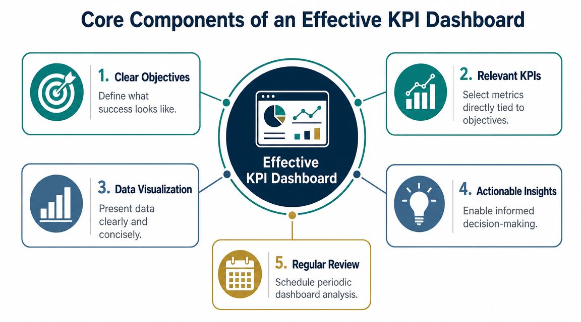
The five pieces that matter
A useful dashboard usually includes these core parts:
Clear objectives
Every KPI should tie back to a goal. If the metric doesn't connect to a decision, remove it.Relevant KPIs
Pick the numbers that move the business. Not vanity metrics. Not random activity counts.Simple visuals
Use trend lines, bar charts, and status indicators that are easy to read fast. The point is speed, not decoration.Context through targets
A raw number by itself is weak. You need a target, benchmark, or expected range so you can tell whether the result is good or bad.Regular review
A dashboard isn't wall art. It needs a review rhythm.
The best dashboard is the one your team can read in a minute and act on in five.
Match the dashboard to the user
Not everyone needs the same view. A business owner needs a high-level picture. A department lead may need more detail. A scheduling coordinator may only need a few daily indicators.
If you're trying to organize the time side of operations, a resource like Discover time insights with the dashboard can help you think about how time data should surface for decision-making, especially in service businesses where labor drives margin.
The key point is simple. One giant dashboard for everyone usually serves nobody well.
KPI Examples for Your Specific Industry
A dashboard gets useful when it reflects how your business makes money. The right KPIs for a law firm aren't the same as the right KPIs for a medical practice or contractor.
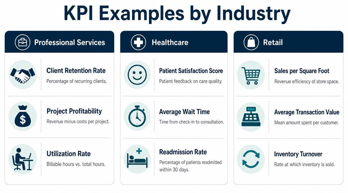
Professional services
If you run an agency, law firm, IT company, or consulting business, labor is usually your biggest cost and your main profit lever.
A strong dashboard often includes:
- Utilization rate: Are paid hours turning into billable or productive work?
- Project profitability: Which client work makes money after labor and overhead?
- Client retention: Are good clients sticking around?
- Average collection time: How long does it take to turn invoices into cash?
- Pipeline quality: Are you winning the right work, or just keeping the team busy?
A consulting firm, for example, might look busy every week and still bleed margin if senior staff spend too much time on low-value tasks or underpriced projects.
Healthcare
In healthcare, owners need financial visibility without losing sight of operations.
A useful dashboard may track:
- Revenue per provider or chair
- Appointment no-shows
- Average wait time
- Claims or collections issues
- Payroll as a share of revenue
A dental office can feel slammed all day and still underperform if the schedule has too many low-value appointments or frequent gaps from cancellations. The dashboard helps separate busyness from healthy economics.
Construction
Construction businesses need operational and financial indicators tied together. Looking at revenue alone won't tell you if jobs are being run well.
Focus on metrics like:
- Job budget versus actual spend
- Change order frequency
- Accounts receivable aging
- Work in progress trends
- Gross profit by job
If one crew consistently runs over budget or one type of project needs constant change orders, the dashboard will expose it faster than a month-end review.
Real estate
Real estate companies and property-focused firms often struggle with timing. Deals don't land evenly, expenses keep coming, and cash can feel unpredictable.
Common dashboard KPIs include:
- Lead-to-close conversion
- Days to close
- Commission or fee revenue by agent or service line
- Marketing cost versus closed business
- Recurring management revenue
If you want a broader list of ideas, this guide to key performance indicators for small business gives good starting points you can adapt by industry.
Good KPIs reflect how your business creates profit, not just how much activity is happening.
How to Read a Dashboard and Make Smarter Decisions
A dashboard isn't there for passive viewing. It's there to help you ask sharper questions.
Too many owners glance at the numbers, feel either relieved or worried, and move on. That's not management. That's mood reading.
Look for trends
A single number matters less than the direction.
If sales are soft one day, that may mean nothing. If sales dip every Friday, that tells you something. If collections are slowing week after week, you need to know why before cash gets tight. Trend lines help you see whether the business is improving, flattening, or slipping.
Look for anomalies
Sometimes one result doesn't fit the pattern. That's useful.
An unusual spike or drop should trigger a question. Did a marketing campaign hit? Did a large client pause work? Did scheduling break down? Did one invoice delay collections? An anomaly is often your first clue that something changed operationally.
When a number surprises you, don't explain it away. Investigate it.
Look for relationships between numbers
Some KPIs make more sense when viewed together.
If labor costs rise, does output rise too? If marketing spend increases, do qualified leads increase with it? If no-shows rise, does provider productivity fall? A dashboard helps you connect those dots instead of staring at isolated metrics.
Different people need different views
Role matters. In many organizations, dashboards are tiered by user. A frontline manager may need only a few metrics with a very fast refresh rate, while an executive needs a broader view plus drill-down ability for root-cause analysis, as explained in Symestic's write-up on role-based KPI dashboards.
For example:
| Role | What they need |
|---|---|
| Owner | Profitability, cash, revenue trends |
| Operations manager | Staffing, throughput, job or project performance |
| Billing lead | Collections, invoice status, aging issues |
If you want to see how this kind of decision-focused reporting looks in finance, this CFO report example is a helpful reference.
Your First Steps to Implement a KPI Dashboard
Most businesses overcomplicate this. They start by shopping for software.
Wrong order.
Pick the questions first. Pick the tool last.
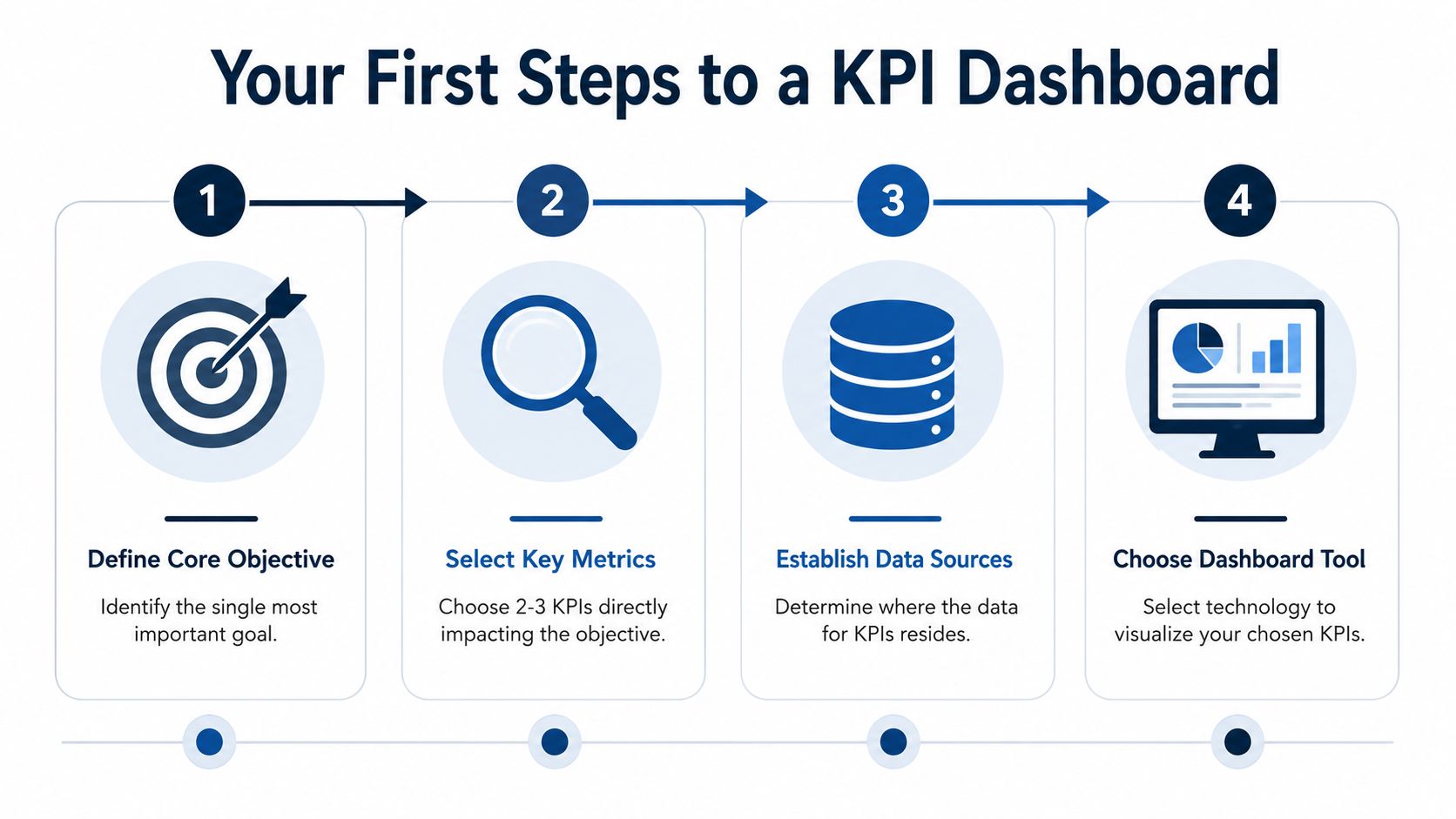
Step one and step two
Start with the business issue that's causing the most stress. Maybe it's cash flow. Maybe it's uncertain job profitability. Maybe it's not knowing whether your team is productive enough.
Then choose a small set of KPIs that directly answer that question. Keep it tight. You do not need a huge dashboard on day one.
- For cash flow problems: You might track collections, invoice backlog, and a cash trend view.
- For margin problems: You might track gross profit by service line, labor efficiency, and pricing realization.
- For growth problems: You might track lead quality, close rate, and revenue by source.
Step three and step four
Next, identify where the data already lives. In many small businesses, that means some mix of QuickBooks, payroll software, a CRM, job costing tools, spreadsheets, and bank data.
After that, pick a delivery method that fits your current maturity.
| Your stage | Good starting option |
|---|---|
| Early stage | Structured spreadsheet or simple reporting pack |
| Growing business | BI dashboard tied to accounting and operations data |
| Need outside help | Advisory partner that builds and maintains reporting |
If you want to understand what strong reporting looks like before choosing tools, this guide on effective data analytic dashboards is a useful outside reference.
And if you need support beyond setup, analytics consulting can help connect the numbers to actual business decisions. MyOfficeOps is one example of a firm that handles bookkeeping, financial analytics, and KPI dashboards for small and midsize companies that don't want to build the whole system internally.
Keeping Your Dashboard Relevant and Useful
A dashboard isn't a one-time project. It's a management habit.
If nobody reviews it regularly, it becomes decoration. If the numbers stay the same while the business changes, it becomes misleading. And if no one owns the metrics, people stop trusting it.
Keep it alive in the real world
The simplest way to make a dashboard useful is to bring it into your regular operating rhythm.
Use it in weekly leadership meetings. Review a small set of numbers. Ask what changed, why it changed, and what decision follows. That's how a dashboard moves from passive reporting to active management.
A few ground rules help:
- Review consistently: Put it on the calendar and protect the time.
- Assign ownership: Each KPI should have a person who watches it and explains changes.
- Update the metrics when goals change: If the business shifts, the dashboard should shift too.
- Remove dead weight: If a metric no longer drives action, cut it.
A useful dashboard doesn't just tell you where you've been. It helps you decide what to do next.
Done right, a KPI dashboard turns messy data into a clearer operating picture. You stop reacting late. You stop managing from scattered reports. You start seeing the business with enough clarity to price better, hire with confidence, and protect profit.
If you want help turning scattered financial and operational data into a dashboard you can use, MyOfficeOps helps small and midsize businesses build clean reporting around cash flow, profitability, and better decision-making.