
You probably know the feeling. Sales are coming in, the bank balance moves around, the team stays busy, and your P&L says you made money. But if someone asks, “Which jobs, clients, or service lines create the profit?” the answer gets fuzzy fast.
I see this with owners around West Chester all the time. A contractor has crews booked solid but can't tell which jobs are carrying the business. An agency owner has strong monthly revenue but one “good” client keeps eating hours. A medical practice looks productive on the schedule, yet one location keeps dragging down margin. The problem usually isn't effort. It's visibility.
A profitability dashboard fixes that when it's built the right way. Not as another pretty report. As a working screen that helps you spot margin problems while there's still time to act.
Why Most SMBs Need a Profitability Dashboard Now
It's Tuesday morning. Payroll clears on Friday. A contractor in Chester County has three crews out, two change orders waiting, and one job that looked profitable at bid time. By the end of the month, the P&L will show the result. By then, the owner cannot change the price, fix the labor mix, or bill for the extra site visit that never made it into the system.
That is why SMBs need a profitability dashboard now, not after year-end and not only when cash gets tight.
The pattern is usually the same. Revenue looks fine. Work is busy. The bank balance goes up and down. But nobody can answer three basic questions quickly: which jobs make money, which clients drain time, and which part of the business is slipping first.
Monthly financials are still necessary. They just arrive too late to run the business day to day.
I build these dashboards for owners who need two different views. One is the owner view. It answers, "Where is profit coming from, and where do I need to step in this week?" The other is the operations view. It answers, "What needs to change today in scheduling, labor, purchasing, scope control, or billing?" If both groups stare at the same screen, one of them usually gets a dashboard that is too vague or too crowded.
A good example of the structure comes from SAP's profitability dashboard documentation. It brings net incoming orders, net sales revenue, cost of goods sold, operating profit, and margin into one interactive view, with comparisons across periods and business dimensions like product category or geography (SAP profitability dashboard example). For an SMB, the dimensions are usually simpler. Jobs, clients, service lines, locations, or providers. The idea is the same. Put profit next to the driver behind it so someone can act.
Here is what that looks like in real businesses:
- Construction owner view: gross profit by job, estimated versus actual labor, open change orders, and billing lag. Decision loop: review every Monday, push approvals, reprice similar work, and step in on jobs where labor is already off plan.
- Construction operations view: crew hours by phase, material overages, callbacks, and unbilled extras. Decision loop: project manager reviews daily, fixes scope creep, adjusts crew assignments, and gets field paperwork submitted.
- Agency owner view: client margin, effective hourly rate, write-offs, and utilization by account. Decision loop: review client pricing each month, trim bad-fit work, and decide where to hire.
- Medical practice operations view: visits by provider, reimbursement by service type, overtime, and no-show impact by location. Decision loop: practice manager adjusts the schedule template, staffing, and payer mix review.
A profitability dashboard ties each KPI to a person and a repeated decision.
It should also set expectations. A dashboard will not fix weak job costing, missing time entry, or sloppy coding in QuickBooks. It will show the problem faster. That can feel uncomfortable at first, especially for owners who have relied on instinct for years. Still, I would rather have an owner see a margin issue by the second week of the month than discover it after payroll, vendor bills, and bonuses are already committed.
A useful dashboard should do a few things well:
- Show current profit drivers in one place
- Split results by job, client, service line, provider, or location
- Compare actual results to prior periods, estimates, or budget
- Let owners spot exceptions fast
- Let operations staff trace the issue to labor, pricing, materials, scope, or billing
It should not create more noise:
- No wall of charts with no clear priority
- No summary-only view that hides which jobs or clients caused the drop
- No manual spreadsheet chase every time an owner asks a basic question
- No single-screen design that treats owner decisions and operations decisions as the same
If your team still relies on monthly statements alone, start with the basics of profitability analysis for small businesses. Then build the dashboard on top of that foundation. That is how it becomes a management tool instead of another report nobody opens.
Choosing the KPIs That Actually Move Profit
A roofing owner opens the dashboard on the 12th of the month and sees revenue pacing ahead of plan. Good news, until the operations view shows two jobs with labor running hot and change orders still unbilled. The owner needs one answer. Are we still making money? The project manager needs a different one. Which jobs need attention today?
That is why KPI selection has to start with decisions, not formulas. If a number does not help one person make the same call every week or every month, it does not belong on the main screen.
I keep each view to 5 to 7 core KPIs. More than that, owners stop scanning and start squinting. Teams can still drill down later. The top layer should stay tight.
A simple rule helps: every KPI needs an owner, a review rhythm, and a clear action. Broader finance teams often formalize that thinking before they build reports, and the same discipline works for smaller companies too, even if the setup is lighter. A strong KPI strategy for enterprises follows the same logic.
Build two views, not one crowded screen
Owners and operations leads do not use the dashboard the same way.
The owner view should answer:
- Are margins holding?
- Which clients, service lines, or locations are dragging profit down?
- Is profit turning into cash?
The operations view should answer:
- Which jobs or providers are off target?
- Is the problem labor, materials, scope creep, write-offs, or slow billing?
- What needs to change before month-end?
That split matters. I have seen plenty of SMB dashboards fail because they mix strategic KPIs with daily operational ones and end up serving neither group well.
The core KPIs I use most often
For SMB profitability work, I usually start with this set and then adjust by industry:
| KPI | Simple Formula | Best View | What Decision It Drives | Review Cadence |
|---|---|---|---|---|
| Gross Margin | (Revenue – direct costs) / Revenue | Owner | Are pricing and direct costs still in line? | Monthly |
| Contribution Margin by Job, Client, or Service Line | Revenue – direct labor – direct costs | Owner and Operations | Which work should we keep, reprice, or stop taking? | Monthly, sometimes weekly |
| Labor Efficiency or Utilization | Billable or productive hours / total paid hours | Operations | Are we staffing jobs and schedules well? | Weekly |
| WIP or Unbilled Revenue | Value earned but not yet billed | Operations | What needs to be billed now to protect cash and margin? | Weekly |
| DSO | Average time to collect receivables | Owner | Is booked profit actually turning into cash? | Weekly |
| Net Margin or EBITDA Margin | Profit / Revenue | Owner | Is the whole business model producing enough return after overhead? | Monthly |
Tie each KPI to a real decision loop
Gross margin is the owner's first filter. If margin slips in a plumbing company, the next question is not abstract. It is usually one of four things: pricing was too low, labor took too long, materials cost more than expected, or the job was sold outside the team's wheelhouse.
Contribution margin by job or client keeps revenue from fooling you. A managed IT firm can have one large client that looks great on the sales report and still produce weak profit once after-hours support, extra onsite visits, and senior engineer time are counted. That client does not always need to be fired. Sometimes it needs a tighter scope, a new price, or a different support model.
Labor efficiency or utilization belongs on the operations view because it points to action fast. In a therapy practice, if provider schedules look full but utilization is weak, the issue may be cancellations, admin overload, or too much non-billable follow-up. The fix is operational, not just financial.
WIP or unbilled revenue matters in project work and healthcare groups alike. In construction, it helps catch approved work sitting in limbo before billing. In a medical practice, the parallel issue might be completed visits delayed by coding or claim submission problems.
DSO shows whether the business can collect what it earned. High profit on paper does not help much if the owner is still stretching payroll because receivables keep aging.
Net margin or EBITDA margin gives the owner the full picture after overhead. I usually keep one of these on the owner view, not both, unless the company has debt or owner add-backs that make net income noisy.
Practical rule: If a KPI does not trigger a specific follow-up, move it off the main dashboard.
Examples by role
Here is what that looks like in practice.
A construction owner checks gross margin by project every Monday. If one job drops below target, the project manager reviews labor hours, subcontractor overruns, and pending change orders that same day.
A marketing agency owner reviews contribution margin by client twice a month. If an account manager keeps adding unscoped revisions, the owner can reprice the account before another quarter slips by.
A two-location dental group watches production, collections, and provider utilization in separate views. The owner cares whether each location is producing enough profit after staff and occupancy costs. The office manager cares whether open chair time, claim lag, or scheduling gaps are causing the shortfall.
Ownership matters more than perfect math
The formula is the easy part. The hard part is deciding who responds when a number moves.
- Owner view KPIs usually belong to the owner, controller, or finance lead.
- Operations view KPIs usually belong to a project manager, office manager, department head, or practice administrator.
- Shared KPIs such as contribution margin need one financial owner and one delivery owner, or nothing changes.
That is the standard I use. Each KPI needs a person, a cadence, and a next step. If those three pieces are missing, the dashboard turns into a scorecard people glance at and ignore.
Connecting Your Data Without Creating Extra Work
A profitability dashboard is only as good as the data feeding it. If revenue sits in QuickBooks, payroll lives somewhere else, hours live in a time app, and job status sits in a project tool, you don't have one story. You have four partial stories.
That's why setup matters more than the chart colors.
Where the numbers usually come from
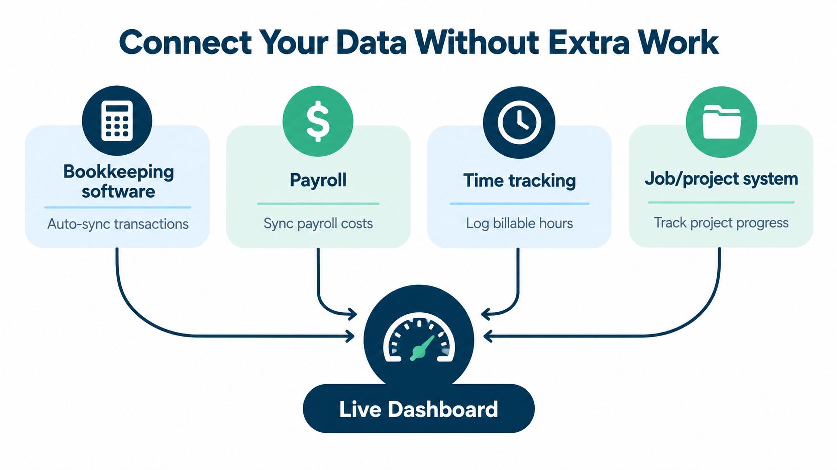
Most SMB dashboards pull from a mix like this:
- Bookkeeping system: QuickBooks Online, Xero, or another accounting tool for revenue, expenses, and account categories
- Payroll system: For wages, employer taxes, and benefits
- Time tracking: For labor by client, matter, job, or project
- Job or project system: For contract value, percent complete, task status, and backlog
Here's the simple version of the flow.
If your tools don't talk well to each other, it helps to understand the basics of accounting software integration for growing businesses. You don't need a giant rebuild. You need clean mapping.
Clean mapping beats heroic spreadsheet work
What usually breaks the dashboard is not the software. It's inconsistent coding.
A few common examples:
- Revenue posted without the right customer or job tag
- Payroll loaded as one lump amount with no job detail
- Reimbursable expenses mixed into direct delivery costs
- Overhead accounts used for direct job costs, or the reverse
- Work in progress handled differently every month
When that happens, the dashboard may still refresh. It just tells the wrong story.
I usually tell owners to leave the chart of accounts mostly alone at first. Instead, tighten the pieces that matter for margin reporting:
- Revenue categories need to reflect how you sell. By service line, by location, by project type, or by provider.
- Cost of goods sold and direct labor need a clean home. If direct costs land in overhead, gross margin becomes useless.
- Job and client tags need to be used consistently by the team entering bills, invoices, and time.
- Payroll burden should include more than base wages if you want true job profitability.
Don't skip labor burden
This is one of the biggest misses in SMB dashboards.
If you only load wages and ignore payroll taxes, benefits, and related labor costs, service work can look more profitable than it is. In a service firm, legal practice, clinic, or trade business, labor is often one of the main drivers of profit. The dashboard has to reflect labor cost, not the cheap version.
When owners tell me a client looks profitable, I usually ask one question first. “Are you counting the full labor cost, or just pay rates?”
For more complex setups, especially when data comes from several systems, some teams look at data orchestration platforms to keep feeds clean and automated. That's useful when the business has outgrown copy-paste reporting.
A good setup feels boring, and that's a good sign
The best dashboards don't create more admin work. They reduce it.
When the data flow is right, the bookkeeping system stays the source for financial truth, payroll feeds labor cost, the time app supplies job effort, and the project tool fills in operational context. Then the dashboard becomes a layer on top, not a second bookkeeping process.
That's also where firms like MyOfficeOps often fit. Not as a dashboard-only tool, but as a bookkeeping and advisory setup that keeps the underlying categories, payroll links, and reporting structure clean enough for the dashboard to stay useful month after month.
Designing a Dashboard Owners Will Actually Use
Monday at 7:15 a.m., the owner opens the dashboard before the first call. They want one answer fast. Are we making money the way we thought we were last month?
The operations lead opens the same system an hour later and needs a different answer. Which jobs, crews, providers, or client accounts need attention today?
That is why one-screen-for-everyone usually fails. Owners and operations managers work from the same numbers, but they make different decisions on different time horizons.
Build two views from the same data
The best setup is one shared data model with two front-end views. Keep the calculations consistent. Change the screen based on the user.
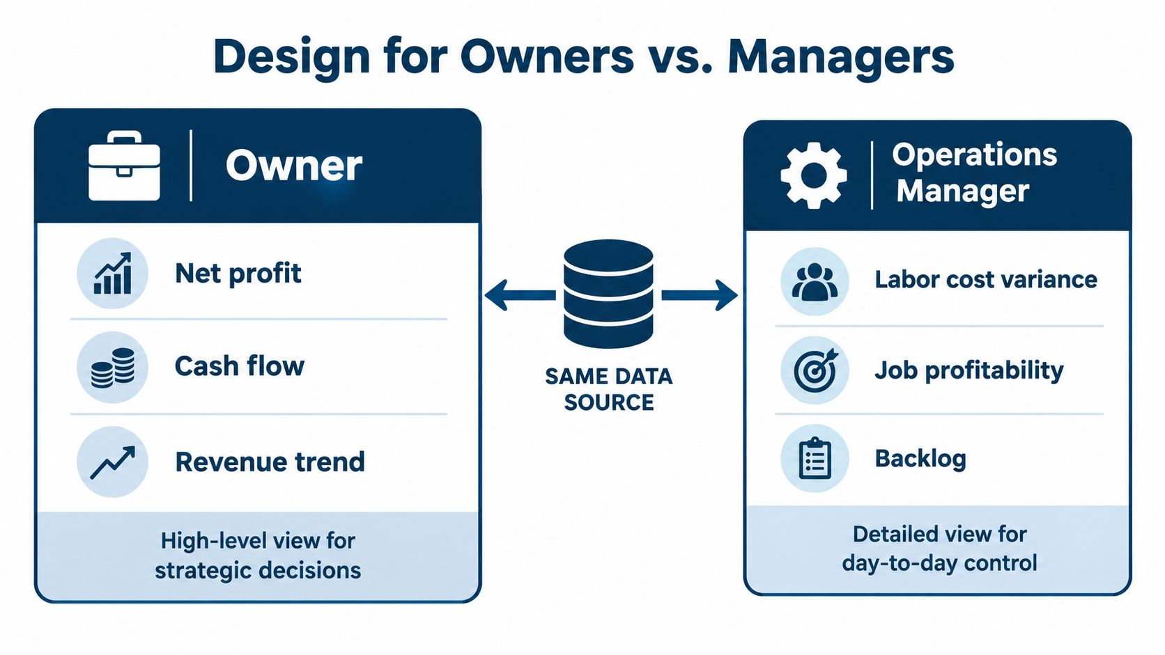
I have seen small companies waste months arguing over dashboard layout when fix was simple. Stop trying to make the owner review labor variance by employee, and stop making the ops manager hunt through high-level margin tiles to find one problem job.
A lot of teams build this in a BI tool. Others want a more guided interface for supervisors and owners who do not live in reports all day. If you want to see how firms approach that kind of build, web app dashboard solutions show the range from an internal reporting layer to a more polished operating tool.
What belongs on the owner view
The owner view should answer a short list of questions in under a minute:
- Are margins holding, improving, or slipping?
- Which client group, service line, or location is changing profit?
- Are we on plan?
- Is cash pressure showing up behind the profit number?
- Where do I need to ask one follow-up question?
That means fewer visuals and clearer comparisons.
For owners, I usually use:
- Scorecards for gross margin, operating profit, and net profit
- Monthly trend lines to show direction, not just a single point
- Budget versus actual visuals for revenue, labor, and overhead
- A ranked list of best and worst clients, jobs, or service lines
- A short exception panel with 3 to 5 items that need discussion
The trade-off is detail. Owners often ask for every slicer and every drill-down on day one. Then they stop opening the dashboard because it feels like work. A clean owner view should raise questions, not answer every one of them on the same screen.
What belongs on the operations view
The operations view supports action inside the month. It needs more detail because the job is different.
A good operations screen connects each KPI to a decision loop:
- Job or project margin. Review scope, staffing, or change orders.
- Labor cost variance. Check scheduling, overtime, mix of senior and junior staff, or missed time entry.
- Hours used versus hours planned. Catch jobs that are burning time too early.
- Open WIP or backlog. Decide what can be billed, what is stalled, and where capacity is tight.
- Gross margin by crew, provider, team, or service line. Find who needs support, pricing changes, or process fixes.
Drill-downs matter here. An ops manager should be able to click from a red margin tile into the job, then into labor, materials, and billing status without exporting three spreadsheets.
Here is the difference in plain language.
Owner view: Margins are down in commercial work.
Operations view: Two commercial jobs ran over labor, one foreman used too much overtime, and one change order still has not been billed.
Same business. Same source data. Different decision loop.
Keep the page easy to scan
A dashboard should feel obvious the first time someone opens it.
A few design choices do most of the work:
- Put profit and margin at the top. The page should start with outcome, not activity.
- Use line charts for trends. Owners and managers both need to see direction across months or weeks.
- Use bar charts for comparisons. Jobs, clients, locations, and providers are easier to scan that way.
- Keep tables lower on the page. Tables are good for review, not for the first read.
- Limit the main screen. If everything is important, nothing stands out.
- Show exceptions in plain English. “Top 3 jobs over labor budget” gets used more than a crowded heat map.
Color helps, but use it carefully. If half the screen is red, nobody knows what matters first. I prefer a simple rule. Reserve bright color for items that need action this week.
Benchmarks can add context, but they should not drive the screen. A plumbing contractor, therapy practice, and marketing agency should not all stare at the same target margin and call it strategy. Set the dashboard up around the choices that business makes. In a service firm, that may be pricing, utilization, and client mix. In construction, it may be labor productivity, change orders, and job closeout speed. In a clinic, it may be provider schedule fill, payer mix, and labor cost per visit.
If a dashboard does not help someone decide what to do next, it is only a prettier report.
Real World Examples for Services Construction and Healthcare
The easiest way to tell if a profitability dashboard works is simple. Did it lead to a decision?
Here are three examples that mirror what I see in the field. Different industries, same idea. The dashboard only matters when it changes what the team does next.

Professional services
A marketing agency may think its biggest client is one of its best because the monthly invoice is healthy and the relationship looks stable.
Then the dashboard shows contribution margin by client. Revenue looks fine, but labor hours and unplanned revisions keep stacking up. The owner view shows the client slipping below the firm's other accounts. The operations view shows where the time is going: too many strategy calls, extra rounds of edits, and support work that never made it into the scope.
The action usually isn't dramatic. It's practical.
- Tighten scope: Define what's included and what becomes change-order work.
- Reset pricing: Raise the monthly fee or move to a better-fit package.
- Shift staffing: Move work to the right level of team member so senior hours aren't wasted.
For firms that bill by project, this often overlaps with project accounting basics for service businesses. If the project coding is weak, client margin gets blurry fast.
The dashboard didn't “find” more profit. It showed the owner where they were giving it away.
Construction
Construction is where a dashboard can save a lot of pain because job profit can look fine until closeout.
A useful construction dashboard should show gross margin by job and projected at completion, not just spent-to-date costs. For this type of work, the gross margin percentage is (contract value – cost) divided by contract value, and that forward-looking view helps catch jobs that look okay now but may finish badly later (construction KPI dashboard guidance).
A real pattern I see is this: a job looks profitable halfway through because change orders haven't fully hit cost yet, or labor productivity is lagging but not obvious on the surface. The dashboard flags the projected-at-completion margin in red. The operations manager drills in and finds one trade phase running over estimate.
The fix might be:
- Reforecast labor for the remaining phase
- Push pending change orders faster
- Adjust crew mix before the overrun gets worse
- Review estimating assumptions for future similar jobs
Healthcare
Healthcare owners often watch visits, providers, and collections. Those matter. But they don't automatically tell you where profit is going.
A clinic dashboard gets more useful when it shows net margin by provider, service line, or location, plus labor burden. Sometimes the issue isn't low patient demand at all. It's scheduling gaps, support staffing that's out of line with volume, or payer mix that leaves one location working hard for thinner margin.
The visual that catches this is usually a simple comparison by provider or site paired with a trend line. One location may have decent top-line activity but weaker margin because staffing patterns don't match appointment flow.
In that case, the action could be:
- Adjust the schedule template
- Rebalance support staff hours
- Separate low-margin service lines from stronger ones
- Review payer mix and reimbursement patterns by location
Different industry, same principle. The dashboard points to the leak. The team still has to fix it.
Putting Your Dashboard Into Action and Keeping It Accurate
Monday morning is when a lot of dashboards fail.
The owner opens the report, sees margin down, and asks a fair question. Is profit slipping, or did someone code payroll to the wrong class on Friday? If nobody in the room can answer that fast, the dashboard loses credibility. Once that trust is gone, people go back to gut feel, side spreadsheets, and long email threads.
A profitability dashboard earns its place by helping two groups make better calls. The owner needs a quick view for cash, margin, and which jobs, clients, or service lines need attention. The operations lead needs a working view that shows what to fix this week, such as labor usage, write-ups, rework, scheduling gaps, or slow change orders. Start there, and keep both views stable long enough for the team to learn them.
A rollout that works in practice
Start simple and make the first version dependable.
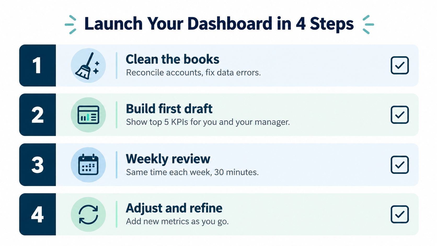
A rollout that works usually looks like this:
- Clean the books: Reconcile accounts, fix coding issues, and separate direct costs from overhead.
- Build two views: Give the owner a short scorecard. Give operations a drill-down view tied to jobs, crews, providers, locations, or client groups.
- Review on a set schedule: Weekly for cash and operational movement. Monthly for margin and broader profitability.
- Tighten one thing at a time: Add a KPI only when someone will use it to make a decision.
That split matters. An owner at a plumbing company may only need four or five numbers in the Monday meeting. Gross margin by job type, cash, open receivables, backlog quality, and projected month-end net income can be enough. The service manager needs more detail. Billable hours by tech, callback rate, average ticket by job type, and labor burden by crew lead to actual changes in dispatch, pricing, and staffing.
The mistakes that break trust
Bad dashboards usually fail for boring reasons, not technical ones.
- Only tracking company-wide profit: This hides weak jobs, weak clients, and weak service lines.
- Mixing overhead into direct costs: Gross margin stops being useful, and job comparisons get muddy.
- Leaving payroll too simple: Service businesses often miss taxes, benefits, and paid time off, which makes labor-heavy work look more profitable than it is.
- Showing the same dashboard to everyone: Owners and operators do not need the same screen.
- Adding too many KPIs: If the team cannot tie a metric to a decision, it becomes decoration.
- Skipping ownership: Each KPI needs one person who checks it and knows what to do when it moves.
One hard truth applies here. A dashboard with weak coding and loose review habits creates false confidence very quickly.
I have seen this with construction firms that review job margin before subcontractor invoices are fully posted, and with medical practices that compare provider margin without allocating support labor the same way each month. In both cases, the problem was not the chart. The problem was inconsistent inputs.
Keep the meeting routine plain. Use the same definitions, the same screen order, and the same owner for each KPI. If gross margin is below target, decide who checks estimate changes, labor hours, or pricing. If DSO starts drifting up, decide who calls on old balances and whether invoicing is going out late. Every number should feed a repeatable decision loop.
If the dashboard changes every week, people stop trusting it. If the logic stays steady and the team learns how to use it, it becomes part of how the business runs.
MyOfficeOps helps small and midsize businesses build the clean books, payroll connections, and reporting structure that make a profitability dashboard useful instead of frustrating. If you want support that goes from core accounting into profit optimization, take a look at MyOfficeOps and see whether a working dashboard setup makes sense for your business.